Sales Dashboard
This guide provides examples, templates and practical advice to help you create a best-in-class sales dashboard of your own.
What is a Sales Dashboard?
A sales dashboard is a BI tool that allows data-driven sales teams to track and analyze KPIs and share this information across an organization. Modern sales dashboards go beyond simple visualization. They integrate with your CRM, marketing, and finance systems, allowing you to easily drill into the data and get real insights – insights that help you forecast more accurately, close more deals, and crush your revenue goals.
Executive Sales Dashboard Examples
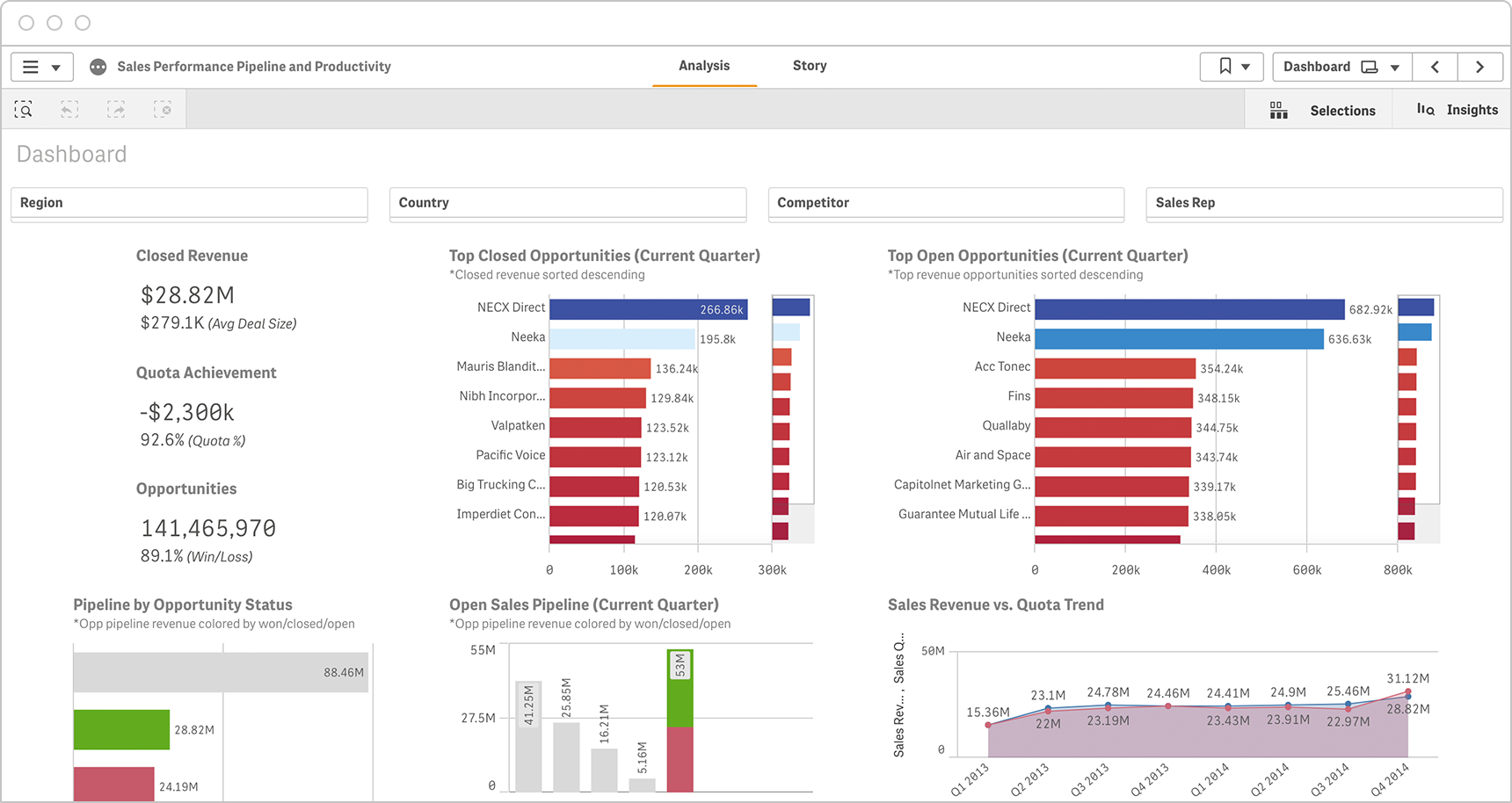
Executive Sales Dashboard
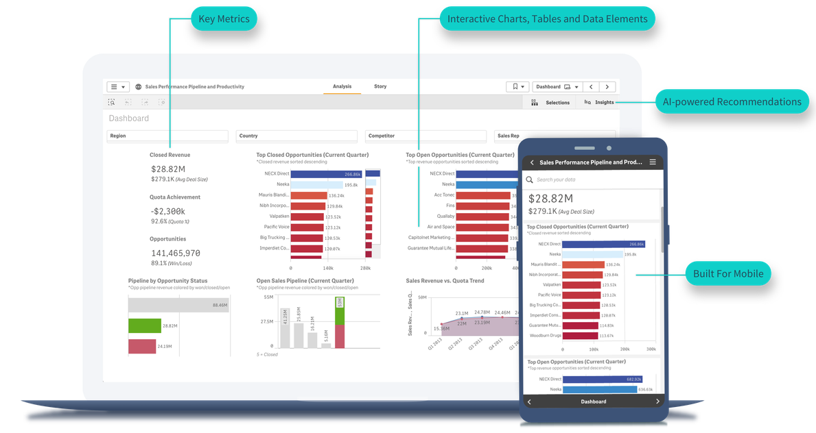
Executives need to quickly assess and share core sales KPIs such as closed revenue, opportunity status, performance vs quota trends and top closed and open opportunities in the current quarter.
Click the dashboard below to explore.
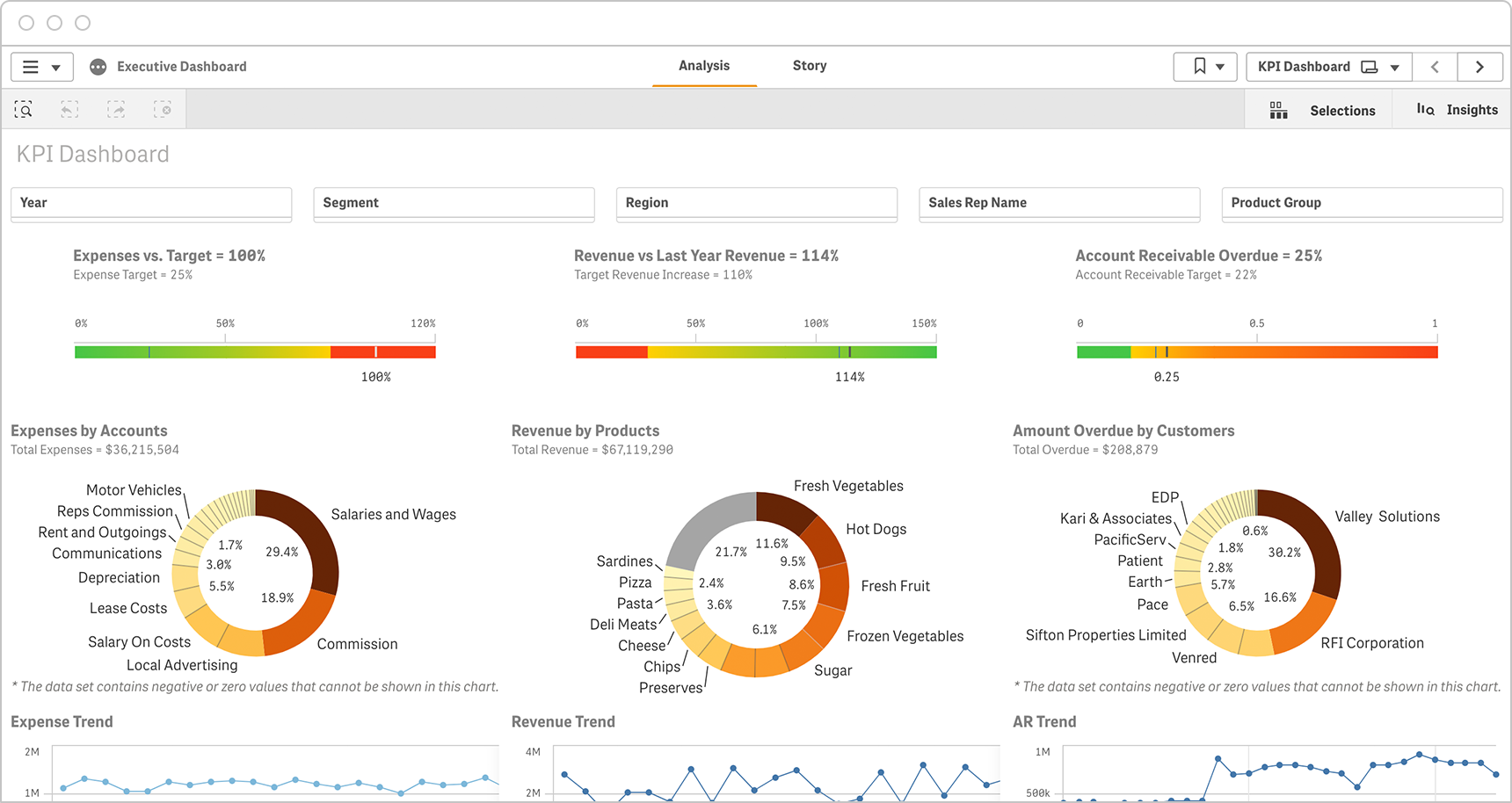
Sales Budget KPIs Dashboard
Naturally, sales leaders track revenue. But they also have to track management metrics like expenses vs target and account receivable percentage. And they need to be able to explore the data by year, segment, region, sales rep and product group. Modern dashboards integrate data from multiple sources to present these KPIs in one place.
Click the dashboard below to explore.
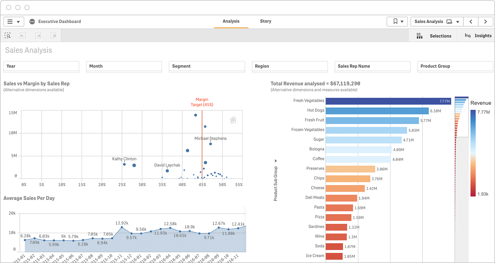
Sales vs Margin Dashboard
Sales executives are accountable to profitability, not just top-line revenue. This sales analysis dashboard provides the sales vs margin by salesperson as a holistic visualization and allows the executive to drill into each reps performance.
Click the dashboard below to explore.
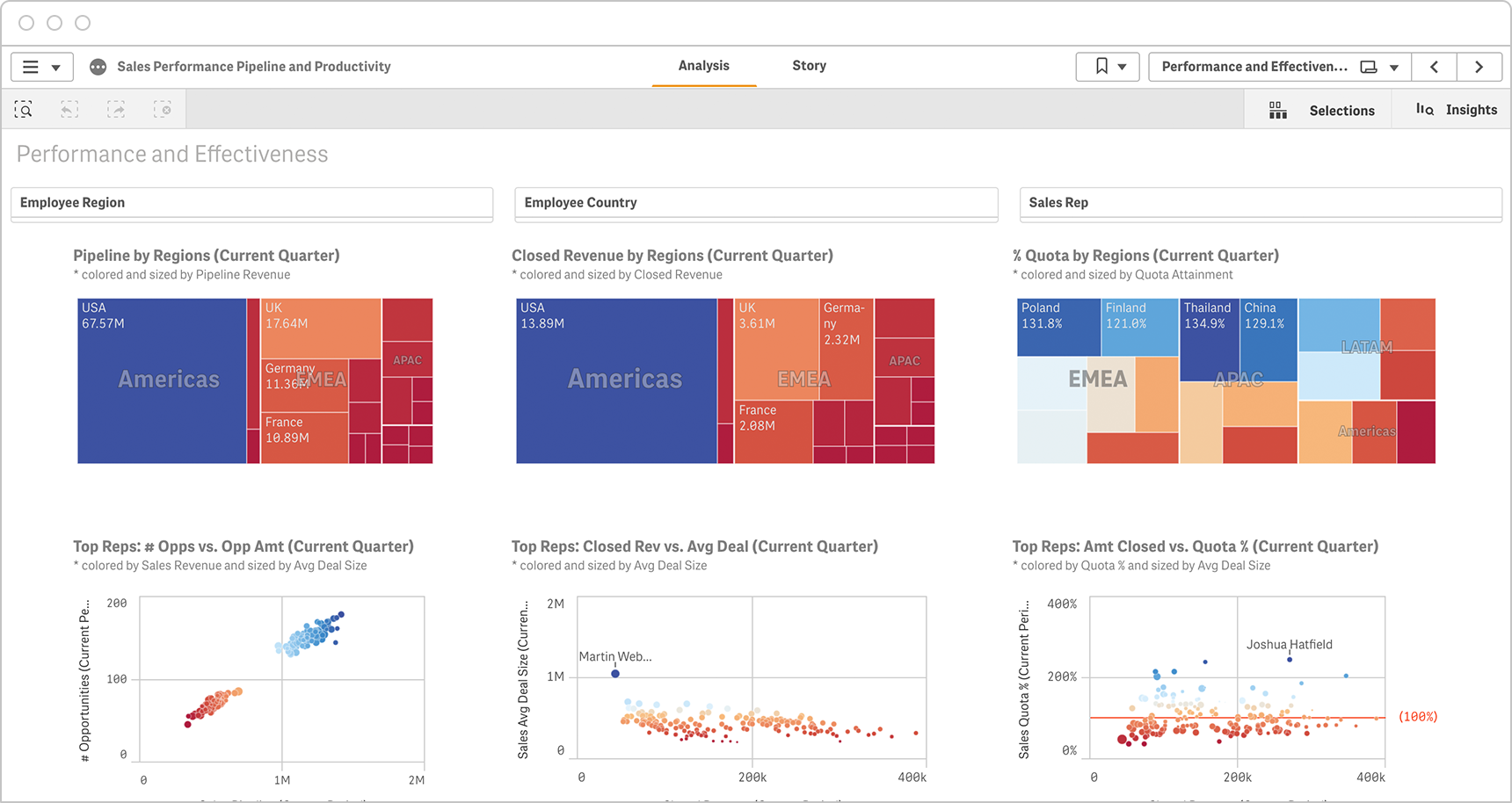
Sales Performance and Productivity Dashboard
Sales execs need a dashboard that gives a complete picture, from macro-level down to individual-level performance, all on one screen. This sales dashboard example allows them to easily drill into data to analyze the health of their pipeline by region, industry, job function or sales representative.
Click the dashboard below to explore.
Dashboard Demo Videos
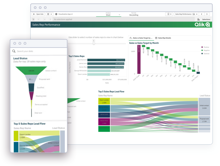
See how to explore information and quickly gain insights.
- Combine data from all your sources
- Dig into visualizations and dashboards
- Get AI-generated insights
Salesforce Dashboard Examples
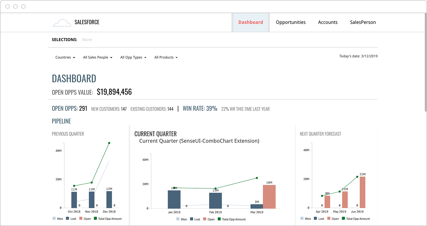
Salesforce Pipeline Dashboard
This interactive dashboard helps sales executives quickly compare pipeline performance for previous, current and future quarters. Top pending deals are highlighted and execs can easily drill into the details to understand and strategize how to increase close rate.
Click the dashboard below to explore.
Salesforce Opportunities Dashboard
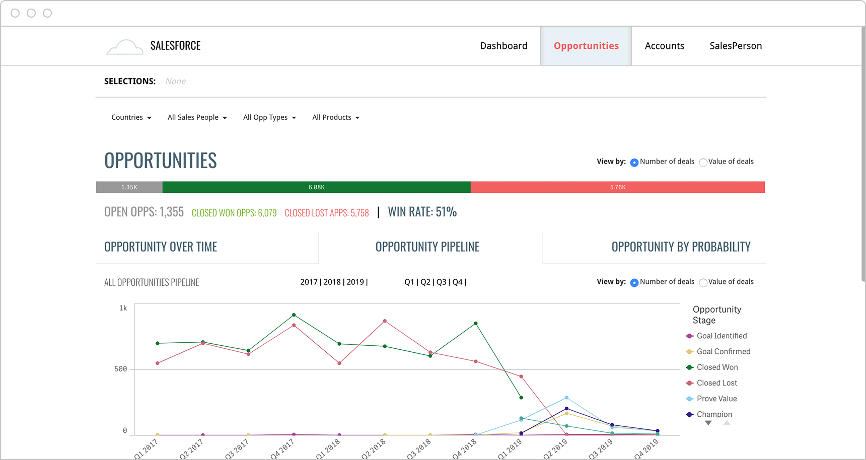
Modern sales dashboards present near real-time data from your CRM in formats and visualizations that are easier for teams to review and act upon. For example, this dashboard allows salespeople to instantly analyze opportunities over time, the opportunity pipeline and opportunities by probability by any time period.
Click the dashboard below to explore.
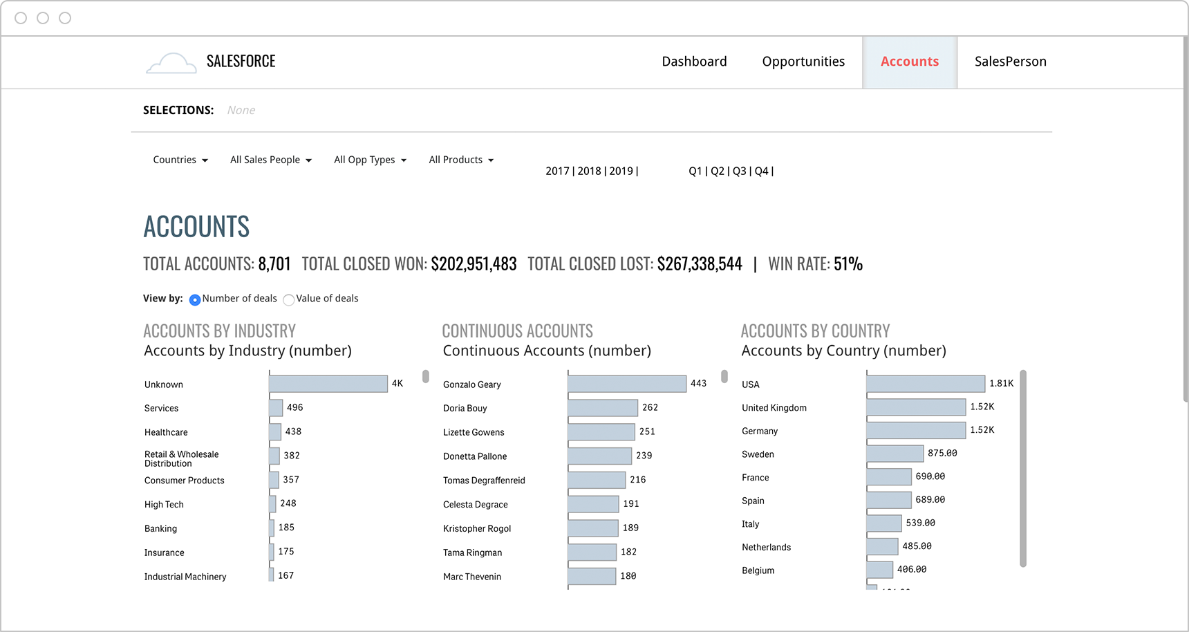
Salesforce Accounts Dashboard
This sales dashboard example allows salespeople to easily view and drill into account data pre-sorted by industry or by region for any time period they choose. This provides both a high-level picture and the ability to get a detailed, account level analysis on the health of their accounts.
Click the dashboard below to explore.
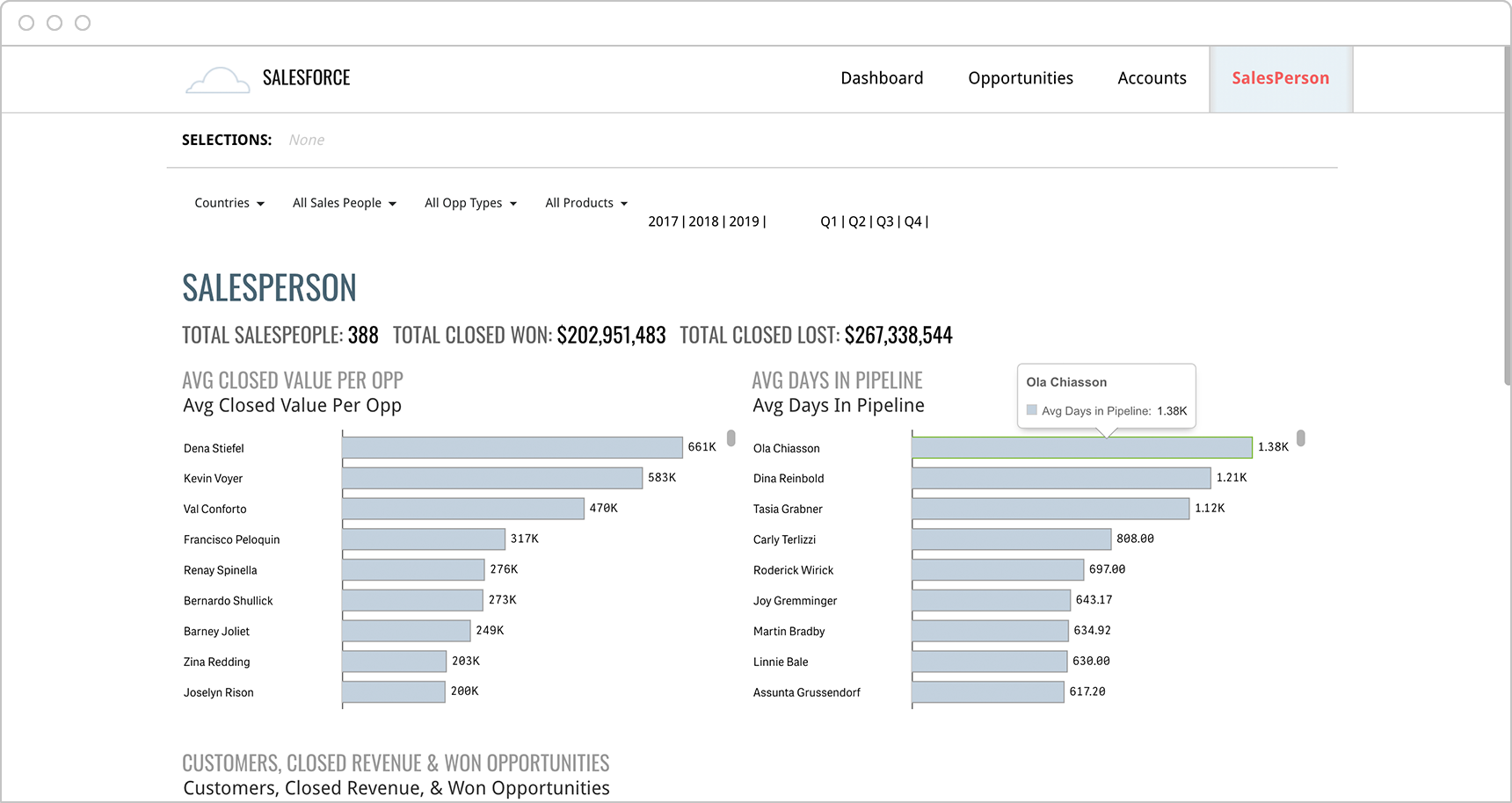
Salesforce Team Performance Dashboard
Sales leaders need to be able to get a quick, up-to-date sense of their team’s performance based on KPIs such as average closed value per opportunity and average days in pipeline. A visualization of the entire team based on parameters such as won opportunity amount and number of customers helps managers spot outlying performers on their team.
Click the dashboard below to explore.
How to Design Best-in-Class Dashboards
Download our ebook with 4 must-see dashboard examples.
Consumer Products & Retail Sales Dashboards
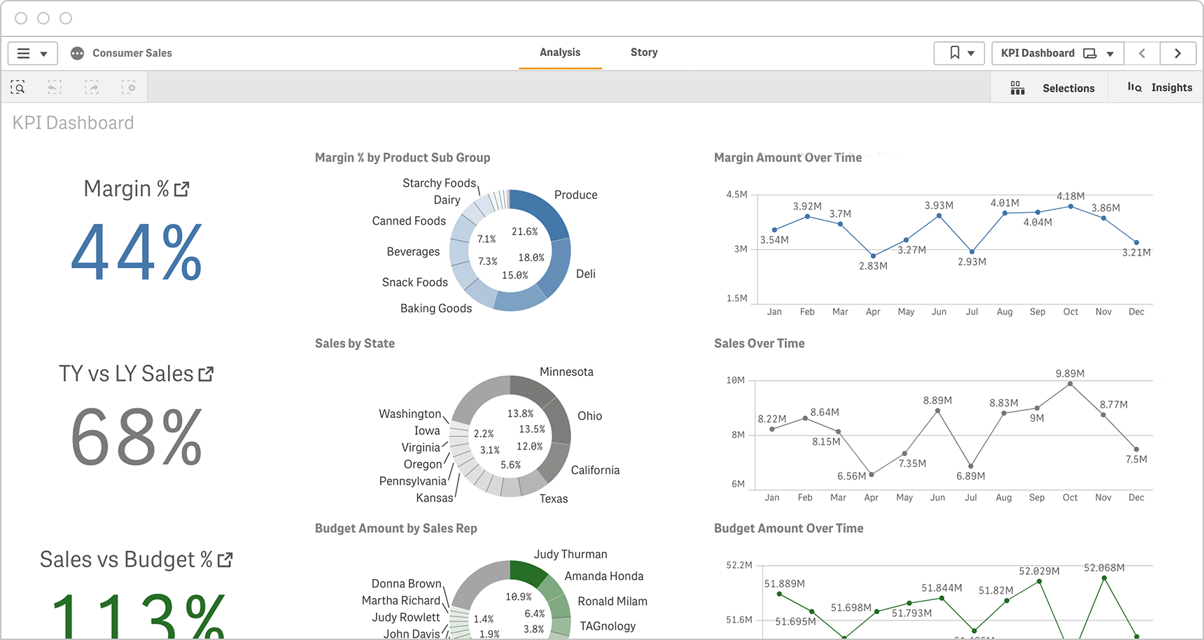
Consumer Sales KPI Dashboard
Consumer sales executives use this dashboard to analyze margin, sales, and budget data on many different dimensions, including: sales rep, product, city, state, region. This allows them to quickly spot trends and act upon issues before they become major problems.
Click the dashboard below to explore.
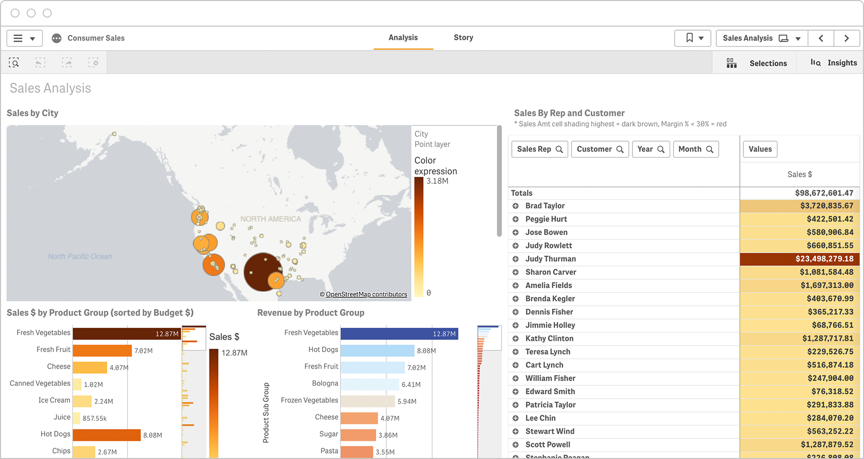
Sales by Region Dashboard
This interactive dashboard allows sales managers to understand revenue by city and by product. They can click on any city to see a complete picture and they can parse the data by sales rep or by customer for any time period. This give them a full picture of how the top and bottom sales reps are performing.
Click the dashboard below to explore.
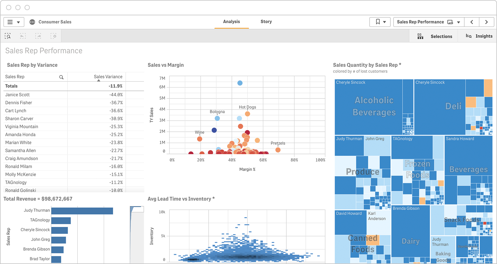
Consumer Sales Rep Performance Dashboard
Given the large product portfolio of consumer products and retail companies, sales leaders need help understanding how each of their reps are performing across all products. This dashboard is designed to show at a glance the sales quantity by product for each rep while also allowing the sales leader to factor in important KPIs such as margin and lead time vs inventory.
Click the dashboard below to explore.
CPG Sales Variance Dashboard
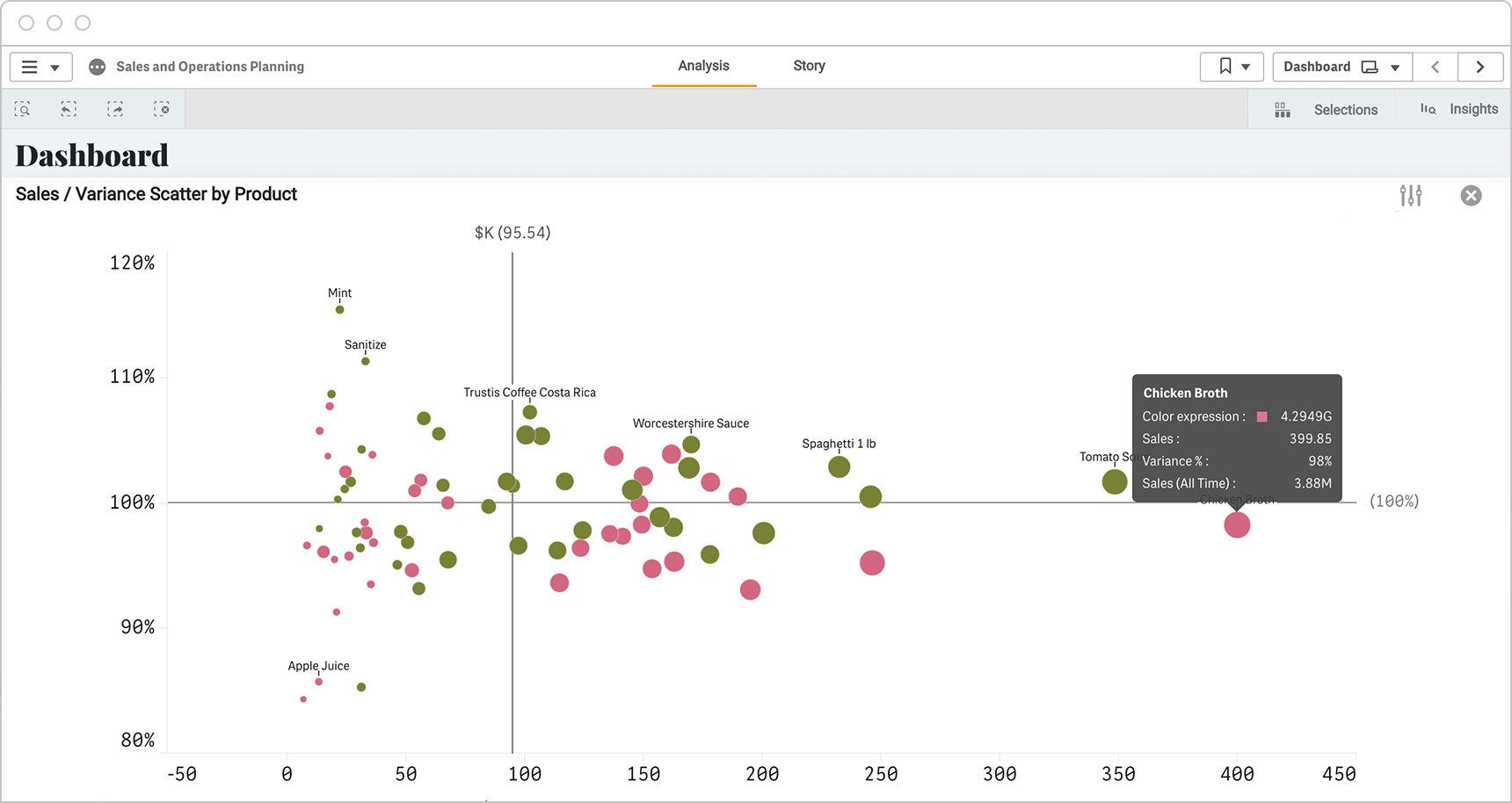
Sales leaders in consumer packaged goods companies also need to quickly assess how all products are performing against goals or previous time periods. This sales/variance visualization presents a clear picture of the full product portfolio and allows for deeper analysis of any data point.
Click the dashboard below to explore.

