Dashboard Design
This guide showcases seven key best practices for dashboard design to help you create better dashboards. Dashboards are essential tools in transforming your data into business value, but no single approach works best for every purpose.
7 Dashboard Design Best Practices
Well-designed dashboards use data to tell a story for a specific audience. There’s no simple trick or single approach that will achieve this goal for every purpose and audience. But following the best practices described below can help you succeed for your specific needs.
1. Know Your Audience
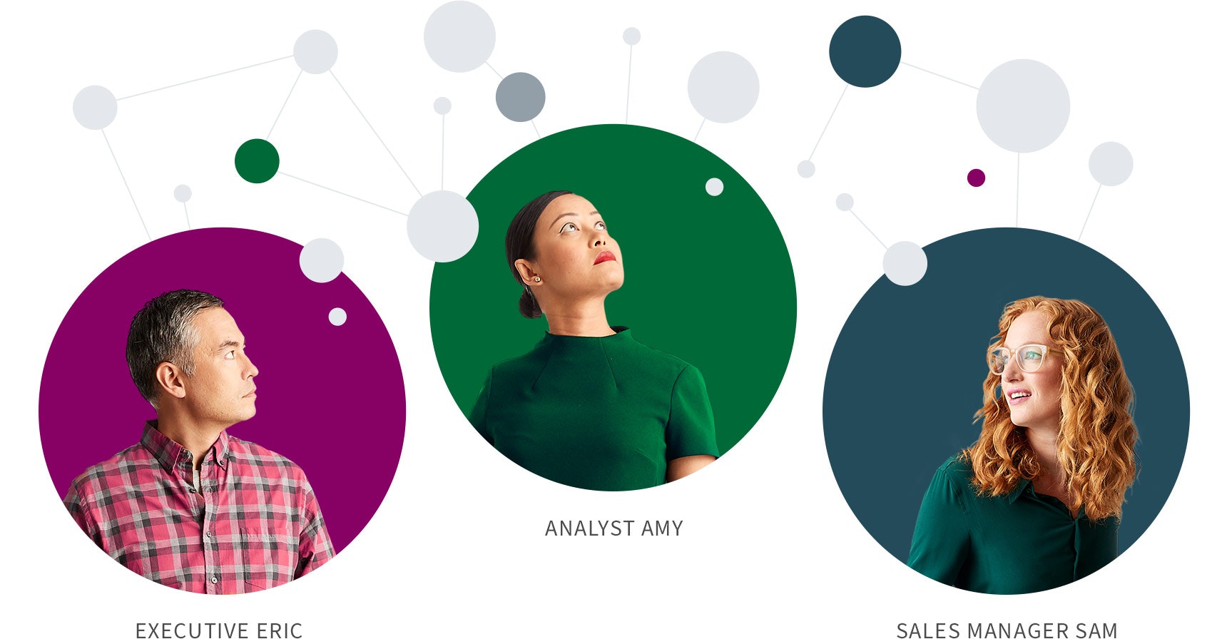
The first critical step in designing your dashboard is to develop a user persona that defines who your audience is, what information they need, and how they will use this information. Some dashboards have broad distribution but most are tailored to specific people or roles such as executives, managers or analysts. These roles have very different needs and expectations when it comes to data.
For example, an analyst will want many data views and the ability to dig into the data to explore more deeply. In contrast, a busy operations manager needs to know at a glance if there are significant deviations from the norm that require immediate action.
Dashboard Demo Videos
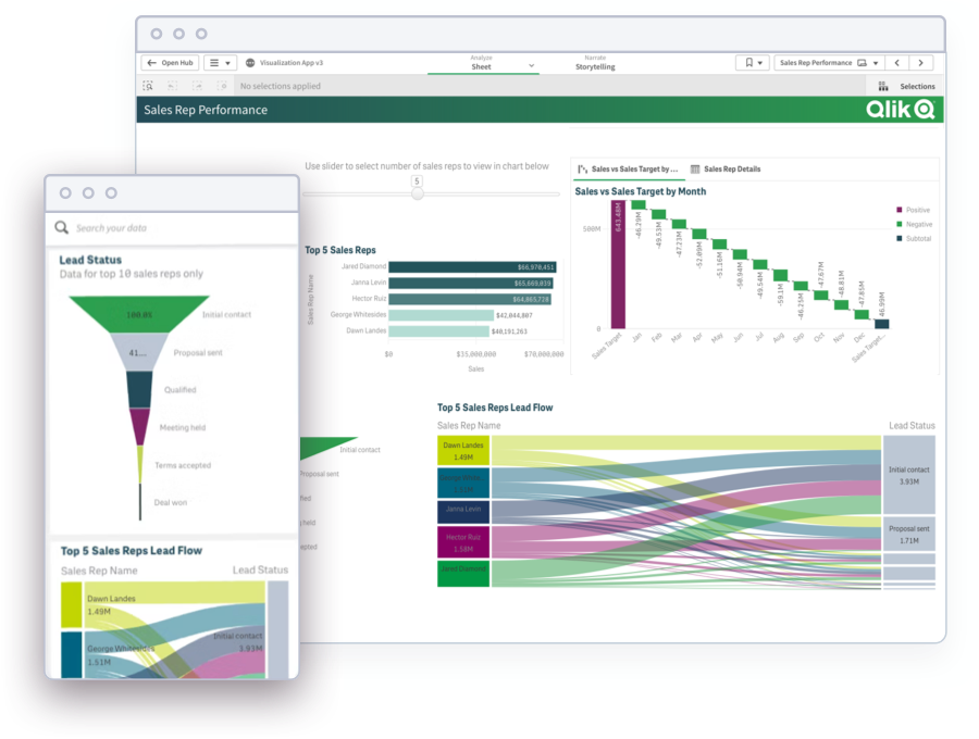
See how to explore information and quickly gain insights.
- Combine data from all your sources
- Dig into visualizations and dashboards
- Get AI-generated insights
2. Choose the Right Type of Dashboard Design
Once you have defined the audience and purpose for your dashboard, make sure to choose the type of dashboard that aligns. There are four main types of business intelligence dashboards based on their purpose: strategic, operational, tactical and analytical. Below we discuss the main attributes and give dashboard examples of each type as inspiration.
Executive Dashboards
These dashboards allow executives to track key performance indicators (KPIs) over time. The purpose here is to analyze bigger-picture trends over longer time periods rather than focusing on immediate, short term actions.
The example below shows how hospital executives can use an executive dashboard to visualize strategic KPIs relevant to management, patient experience, and staff dynamics.
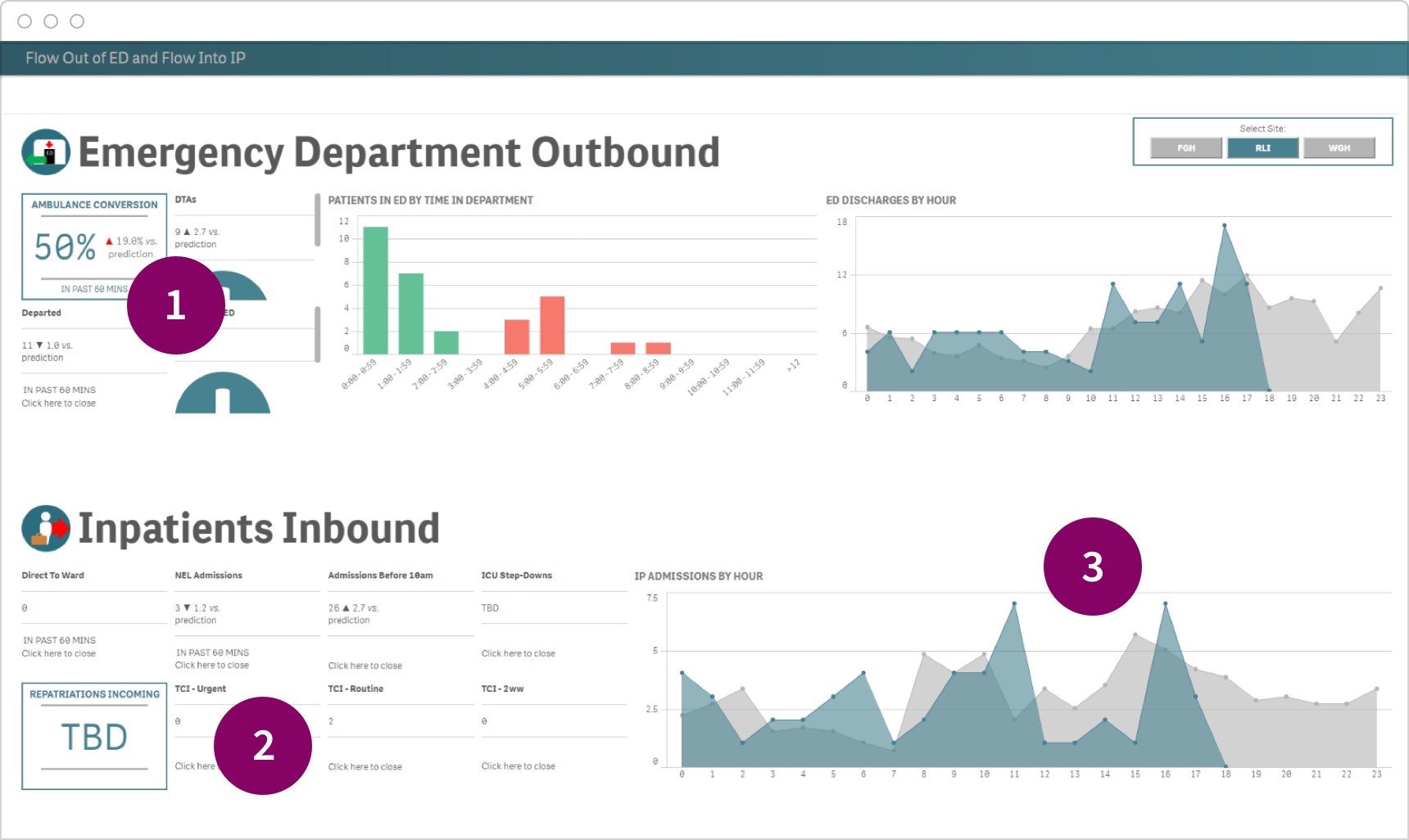
- High-level KPIs give executives a big-picture view of critical success factors.
- Predictions indicate whether key indicators are performing better or worse than expected.
- Time-based trends provide a view of overall activity, and can be shared with higher-level management as needed
Operational Dashboards
The purpose of operational dashboards is to quickly tell the user what’s happening in the moment and to highlight when and where critical issues occur. Use this type of dashboard for time-sensitive information and to highlight deviations in the data so that users can take action.
For example, a police force can use an operational dashboard to track the location and volume of police reports and provide a snapshot of incidents teams should be prepared to deal with.
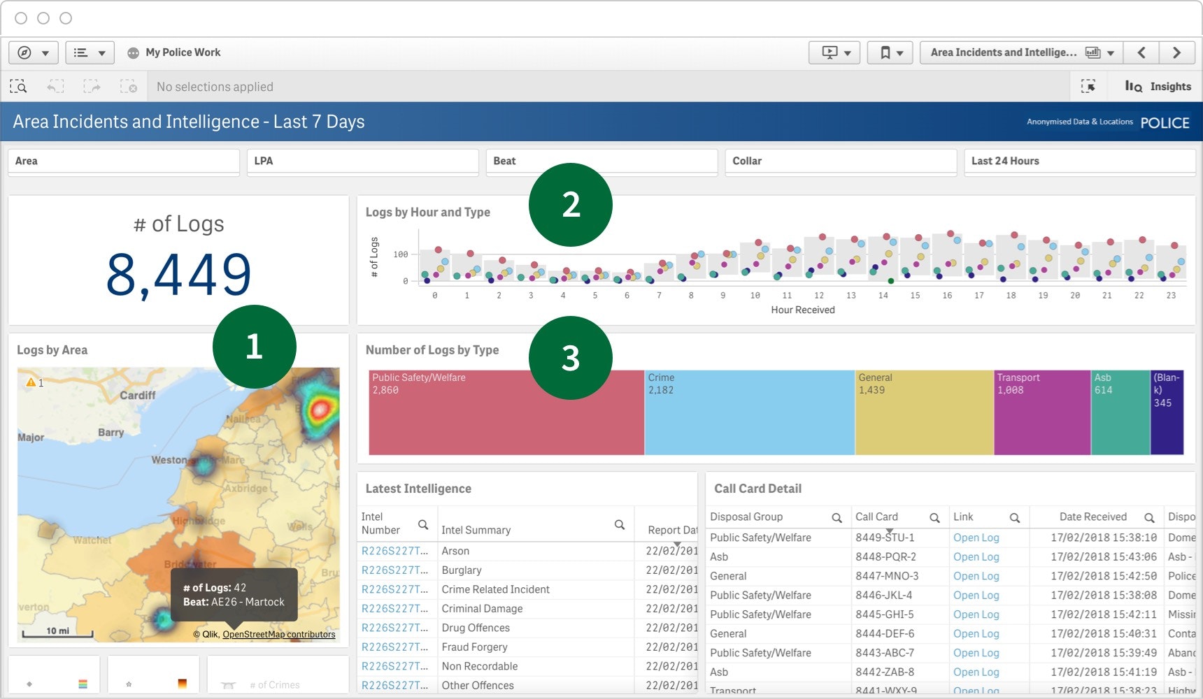
- Heatmaps make it easy to quickly spot areas where activity levels are high.
- Log tracking over time helps teams predict what time of day workloads will be highest.
- Log types provide a quick snapshot of the kind of incidents teams should be prepared to deal with.
Tactical Dashboards
Tactical dashboards help users track progress toward specific goals or time periods. Users should be able to click on the dashboard to quickly and easily drill in to the data on the dashboard itself to explore problems and opportunities.
In this example, a software company can use a tactical dashboard to make faster, better informed decisions with information on browsing and purchase behavior, interactions across digital channels, and more.
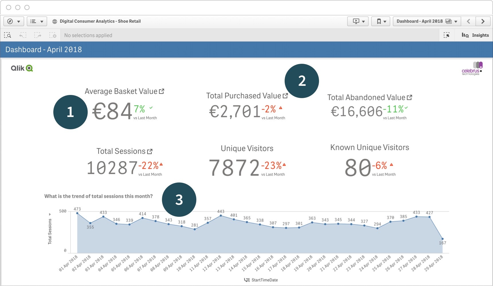
- Key data points are enhanced by trending information; how much this number changed from the prior month.
- More detailed insights can be found by drilling down into additional data.
- A day-to-day view allows teams to look more closely at activity and what caused it.
Analytical Dashboards
Analytical dashboards are typically created and used by analysts as an interactive tool to help them better support business people in analyzing trends and identifying issues. They usually have minimal graphic elements and instead strive to present as many data views as possible. Here especially, the user needs to be able to drill down into additional data for more detailed analysis.
The example below showcases how a CPG company can use an analytics dashboard to track trends, forecast market share, and compare sales against competitors.
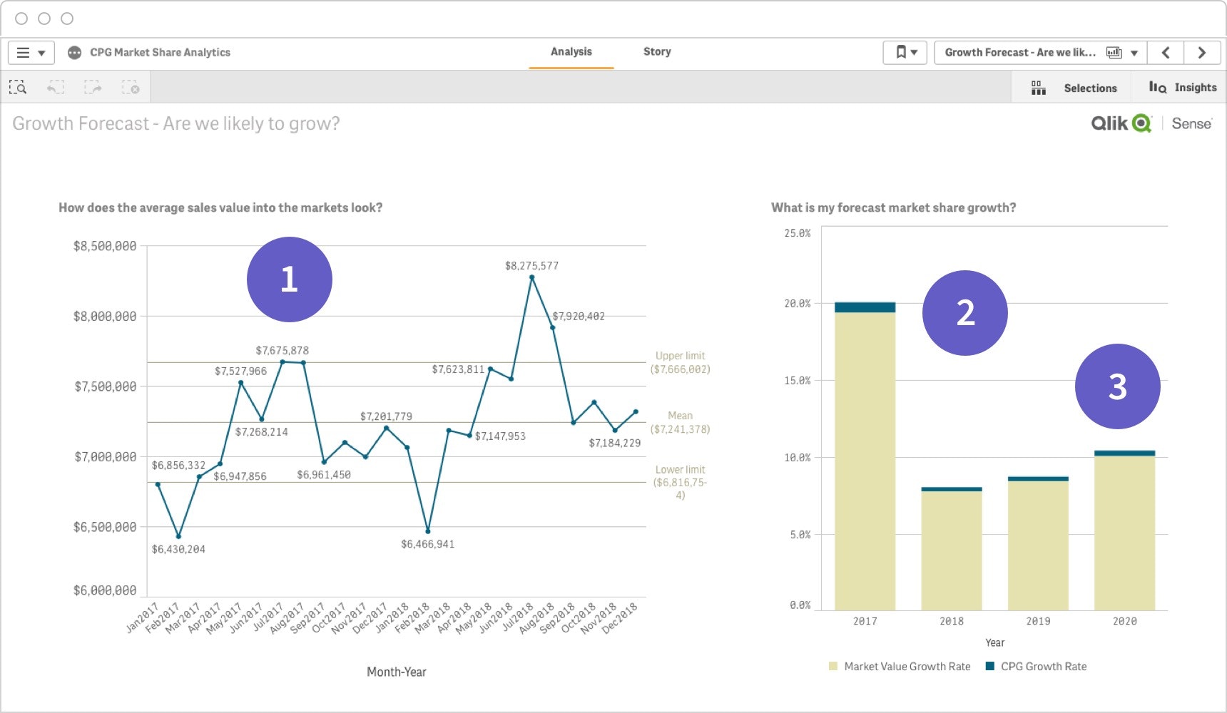
- Viewing market valuation over time helps guide business decisions.
- Forecasts can be used alongside other data to drive business planning and resourcing.
- Comparison data shows sales versus key competitors in an easy-to-read, side-by-side format.
Get smarter about dashboard design with these top resources

3. Identify Your Key Metrics
4. Tell a story with your data
5. Choose the Right Types of Charts
Comparison Charts

Composition Charts

Distribution Charts

Relationship Charts

6. Apply Essential Dashboard UI Design Principles
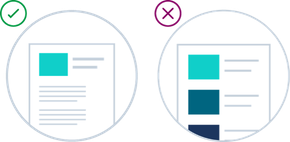
Organize the Information
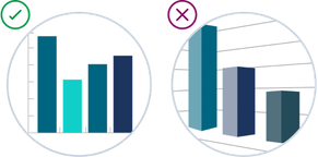
Keep it Simple

Provide Visual Cues
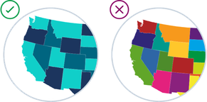
Get Color Right
7. Iterate and evolve
Download our ebook with 4 must-see dashboard examples.
Benefits of best in class dashboard design
-
Transform data into business value
Most organizations have huge quantities of unorganized data. Well-designed dashboards help users know what data points to focus on and understand what the data means so they can make better business decisions. -
Rally key stakeholders
Great dashboard design will help you make your case with decision makers across your organization and act quickly in response to changing needs. For example, visualizing market trends could help get executive approval on a new business venture. -
Drive data literacy
Sharing dashboards of trustworthy and organized data throughout all levels of your organization fosters a data-driven culture. Modern dashboards enable users to explore the data directly from within the dashboard which encourages employees at all levels to make discoveries and innovate.

