Dashboard Reporting
What it is, why it matters, and best practices. This guide provides examples and practical advice to help you produce world-class dashboard reporting.
What is Dashboard Reporting?
Dashboard reporting helps you make better informed decisions by allowing you to not only visualize KPIs and track performance, but also interact with data directly within the dashboard to analyze trends and gain insights. Modern reporting pulls in data from multiple sources to give you a complete picture of your business. Best-in-class dashboards also integrate AI-powered recommendations, big data scalability, embedded visualizations, and governed self-service.
Dashboard vs Report
People often wonder: What’s the difference between a dashboard vs report?
- A modern, interactive dashboard provides compelling data visualization and lets you interact with and explore data to gain insights into why things are happening or have happened.
- Static reports can also include graphs and charts but merely present a snapshot of historical data. They tell you about what happened in the past and are usually run on a regular basis, like daily, weekly or monthly.
More resources:
- Compare top dashboard software options
- Find the right KPIs for your business with KPI examples
Learn how to design world-class dashboards.
Four Key Types
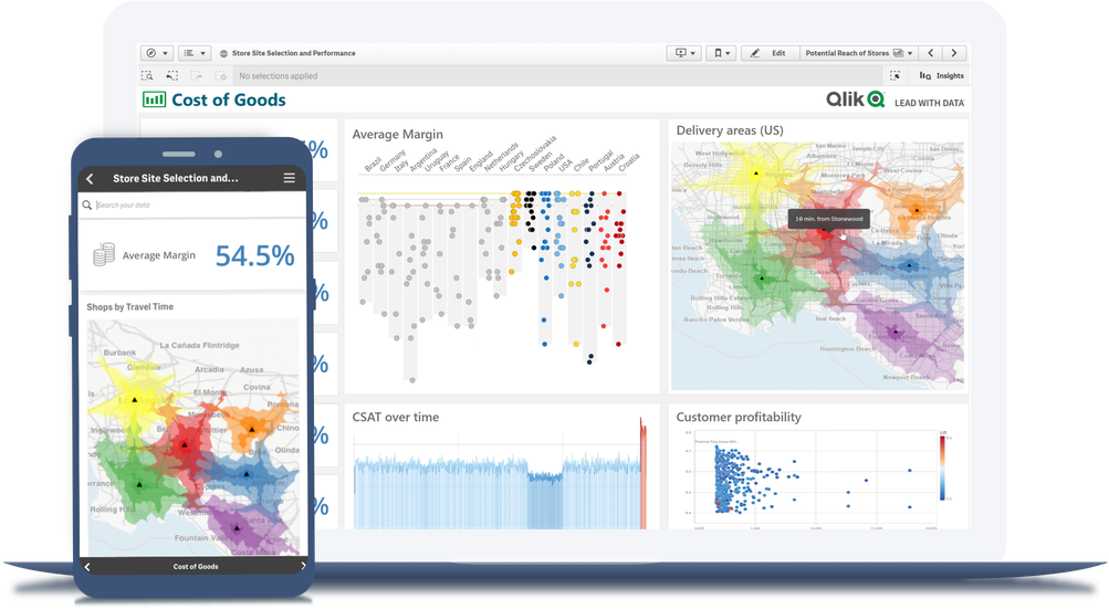
To get the clearest picture of your data, you’ll need to choose the right dashboard type for your needs. The four types of dashboards include: analytical, executive, operational, and tactical. Here you’ll find a brief overview of each, including dashboard reporting examples.
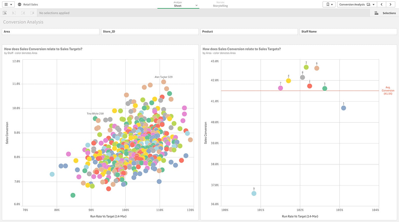
Analytical Dashboards
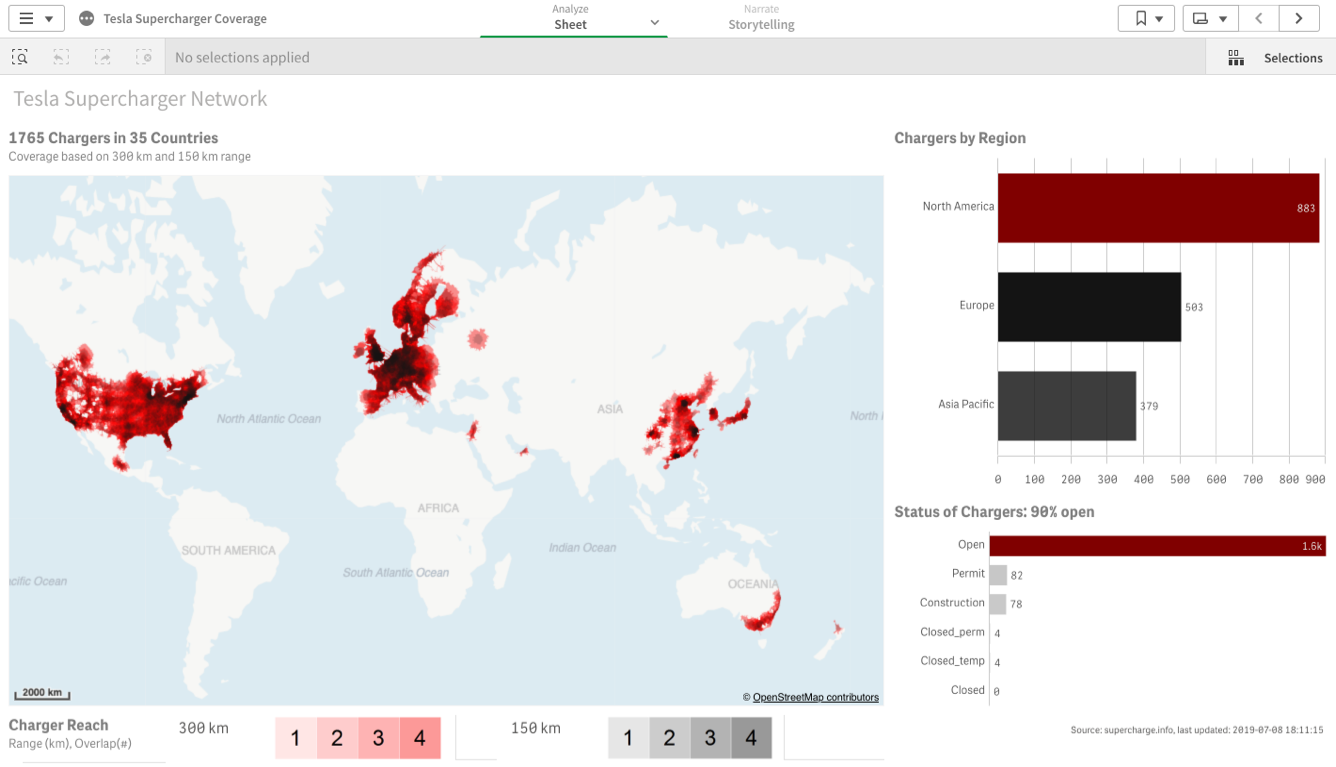
Because analytical dashboards are used by data analysts to support workers across the business, they typically include simple graphic elements and a lot of flexibility for detailed analysis. In this example, you can see how a CPG company can keep track of trends, explore competitive sales and forecast market share.
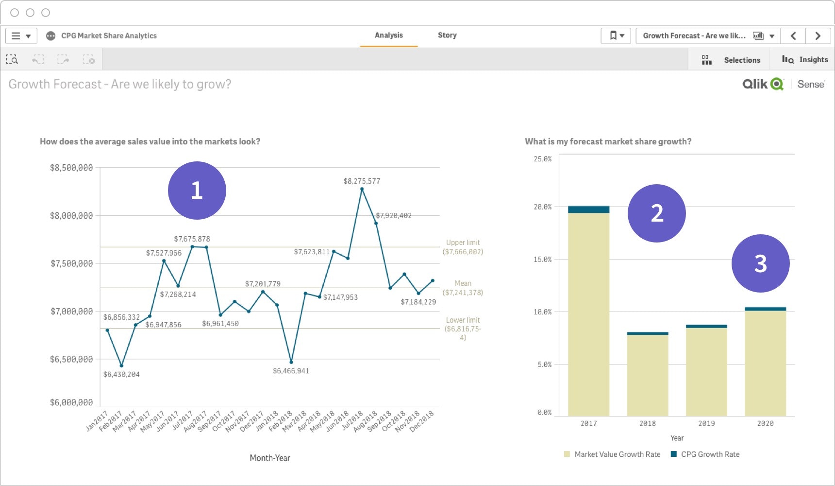
- With the ability to analyze market valuation over time, business users can make more precise, data-driven decisions.
- Easy-to-understand forecasting insights can help employees better plan and allocate resources.
- With side-by-side comparison data, workers can quickly see how the company stacks up against competitors.
Strategic Dashboards
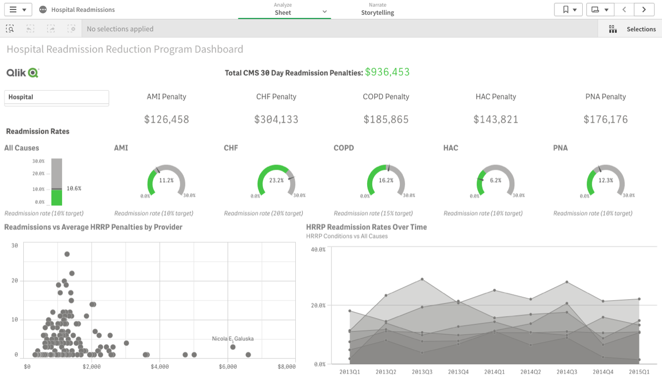
With strategic dashboards, business leaders can track KPIs over specific time periods to gain strategic insights. Here’s an example for hospital executives that allows them to track patient experience, staff and management KPIs.
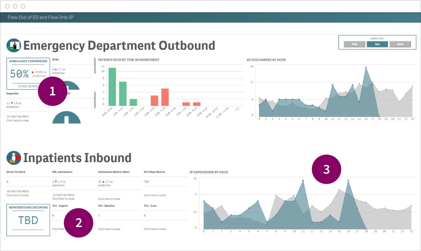
- Executives can freely explore strategic KPIs and track critical success factors.
- Predictions help leaders understand which metrics are likely to be on target, so they can make decisions accordingly.
- Data can be analyzed from every angle, providing trends over time that can be easily shared with the rest of the organization.
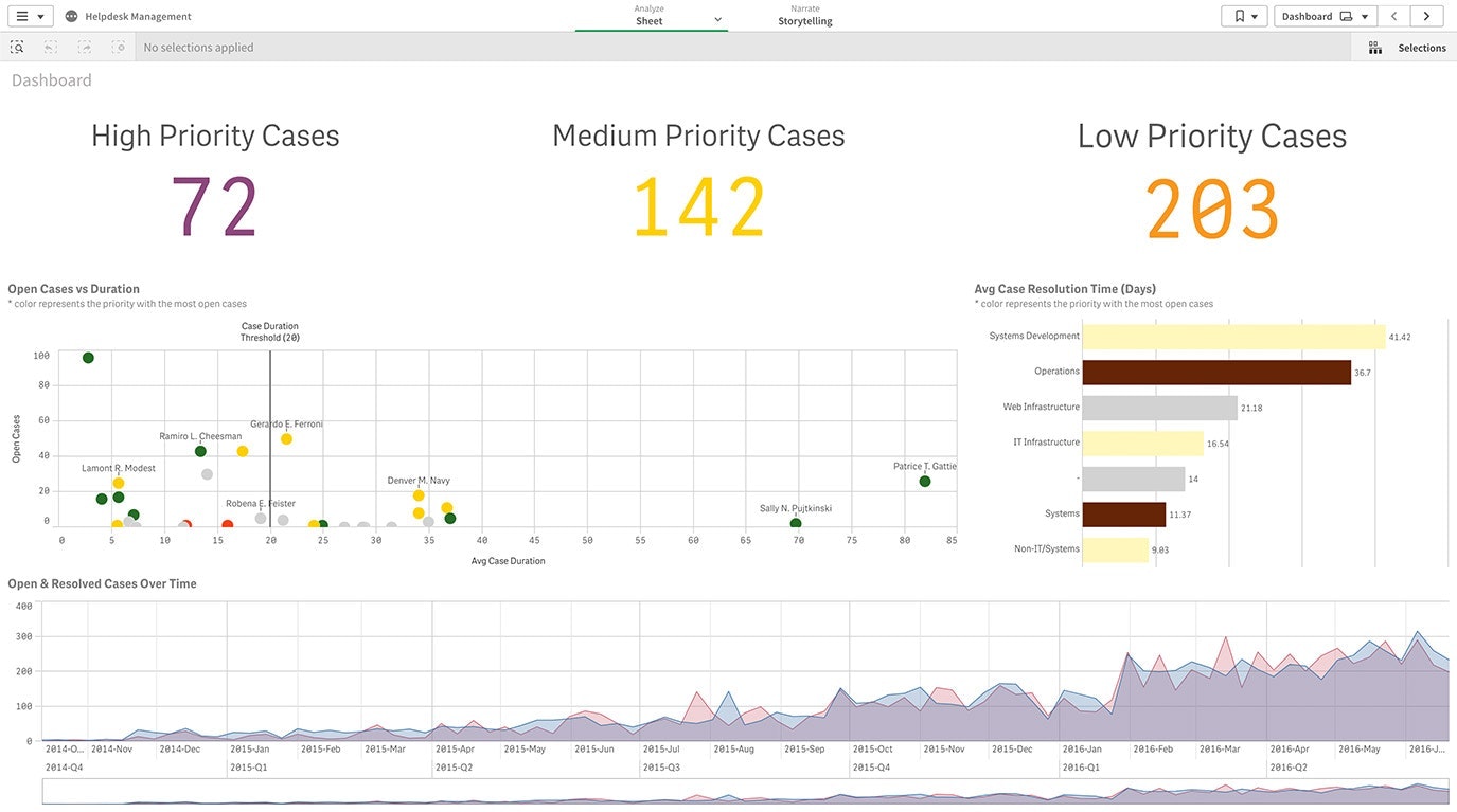
Operational Dashboards
Operational dashboards help business users see what’s happening now, flagging any issues that need immediate attention. In this example, police are provided with a quick snapshot of incidents to help the force prepare to take the appropriate action.
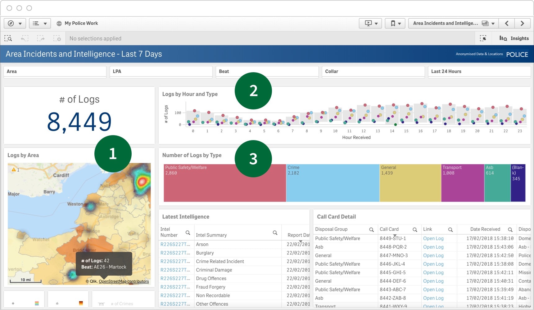
- Heatmaps highlight areas with high levels of activity, making it simple for users to find the information they need quickly.
- With log tracking, teams can predict activity levels for each time of the day.
- Teams can quickly see the types of incidents they should prepare for with the help of log types.
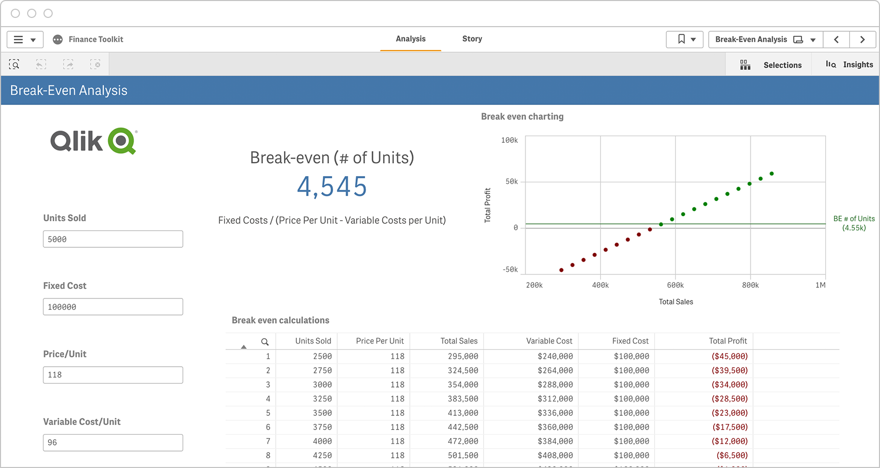
Tactical Dashboards
If you want to track progress toward goals by immediately drilling into your dashboard data, you should choose tactical dashboard reporting. The following example shows how decision-makers at a software company can make more informed decisions by exploring data around browsing and buying behaviors, digital interactions and other important metrics.
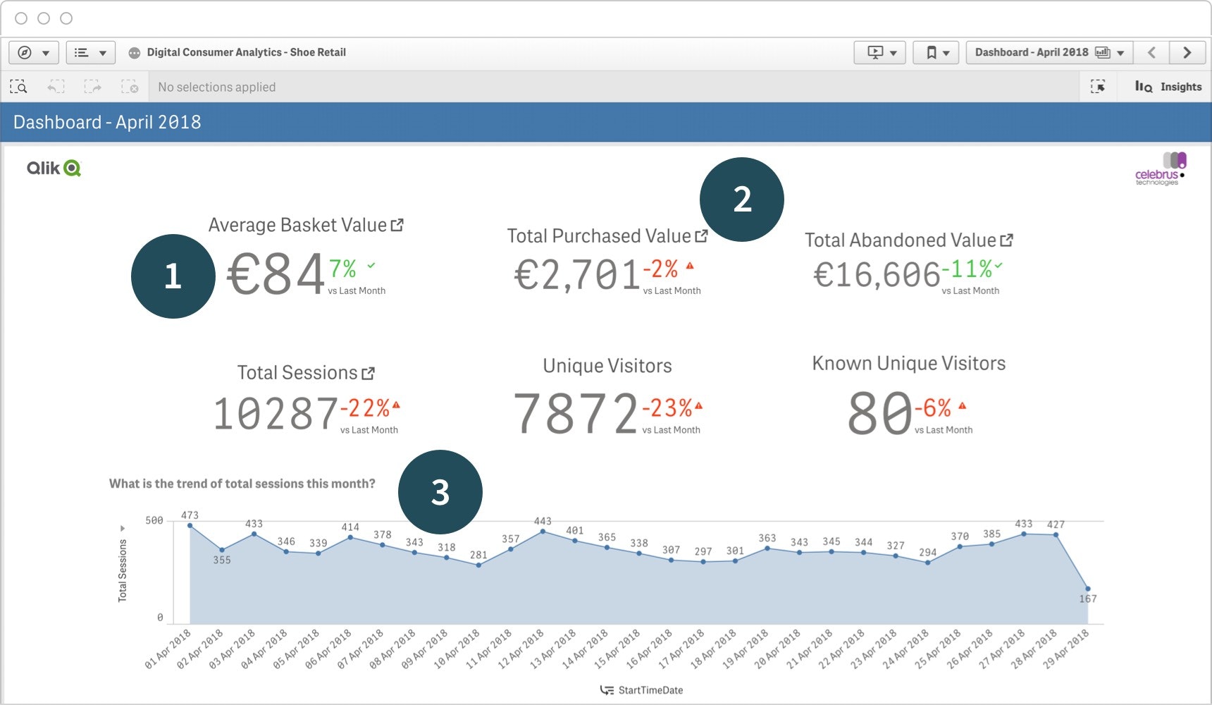
- Tactical dashboards provide trending information around key data points, such as changes from the prior month.
- Drill down into your data for deeper insights.
- View daily activity to identify outstanding issues and their causes.
Dashboard Demo Videos
See how to explore information and quickly gain insights.
- Combine data from all your sources
- Dig into visualizations and dashboards
- Get AI-generated insights
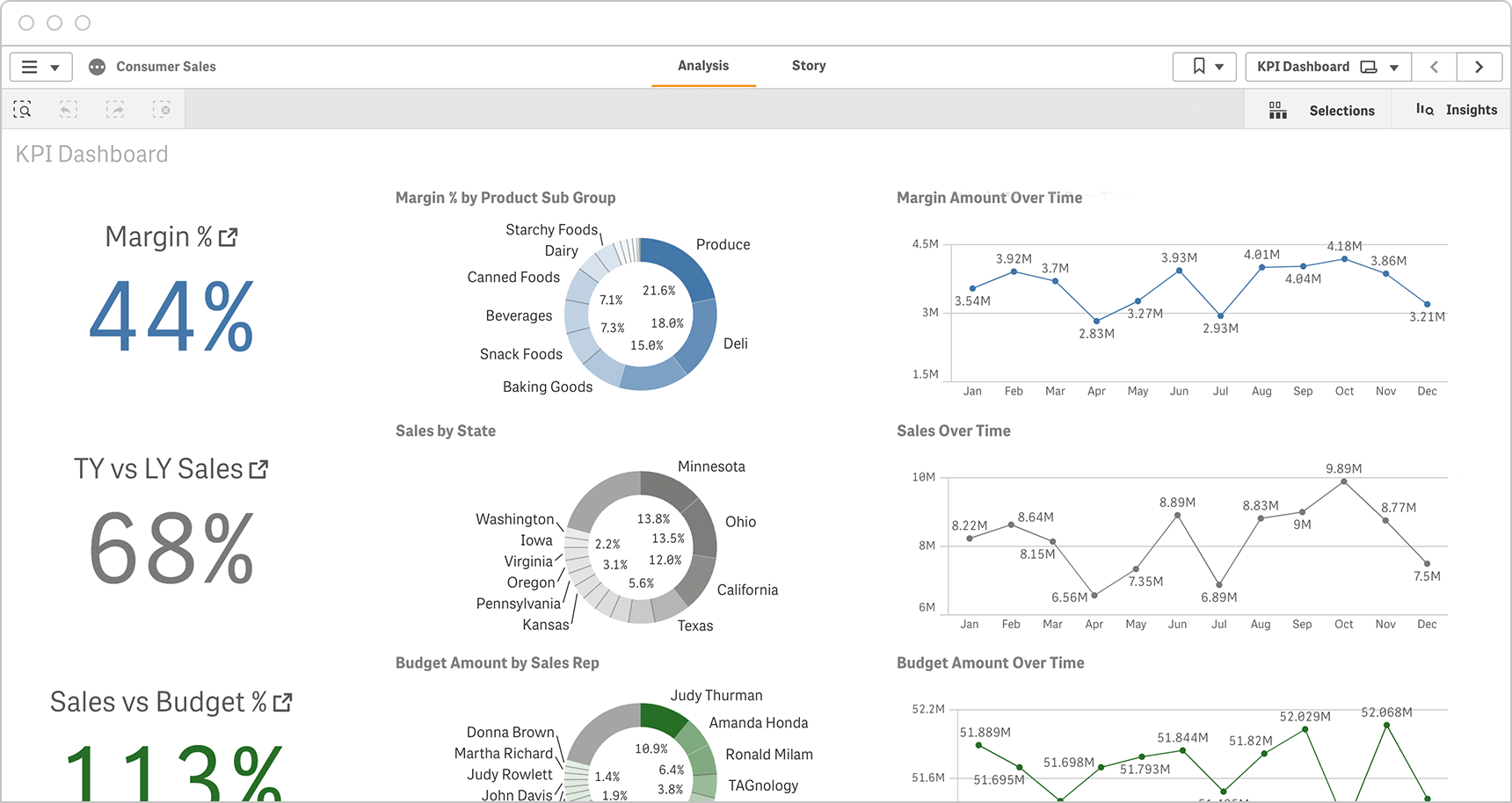
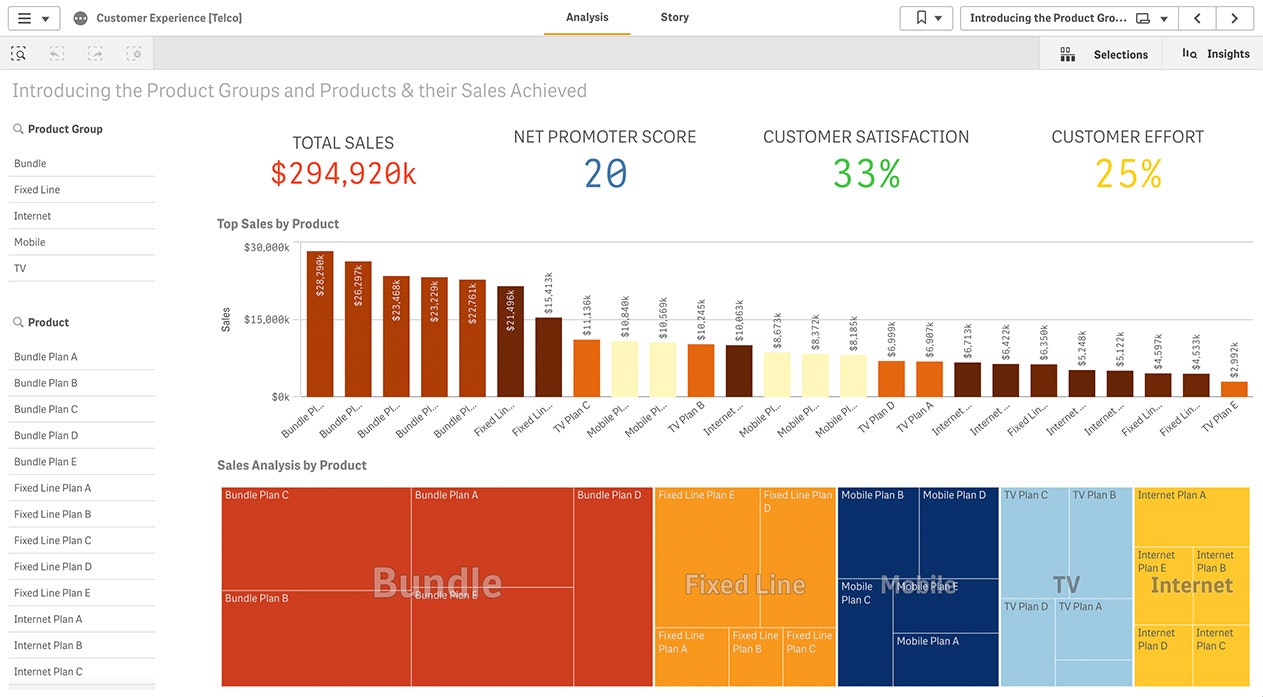
Dashboard Reporting Examples
Get a better understanding of how you can use dashboards in your own organization by taking a look at the following examples by industry and job function.
Dashboard Reporting Examples by Industry
From retail and healthcare to manufacturing and financial services, here’s how various industries are using dashboards to get ahead.
-
Retail
Analyze shopping behaviors by channel, customer engagement and other critical KPIs to help increase sales and maximize profit.
-
Financial Services
Maximize performance while keeping costs down by analyzing revenue, and margins, and identifying the most profitable customers.
-
High Tech
Increase innovation, get a handle on your supply chain, boost agility and increase profitability with clear, in-depth high tech dashboard reporting.
-
Healthcare
Healthcare dashboard reporting can help you drill into patient care KPIs to better manage your workforce and improve patient outcomes.
-
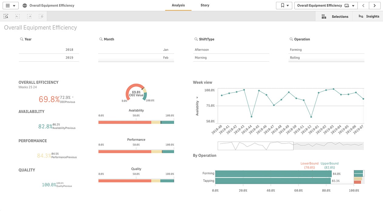
Manufacturing
Analyze your critical KPIs to build efficiencies into your plant operations and keep your supply chain functioning smoothly.
Find out the most effective ways to make an impact when you share data stories.
Dashboard Reporting Examples by Job Function
-
Marketing
Combine data from CRM, advertising and web analytics tools to better understand customer behavior and increase marketing ROI.
-
IT
Get a clear view of applications and systems to improve security, scalability and governance, as well as address emerging technology needs.
-
Finance
Keep costs and risk down while increasing profitability by taking a deeper dive into procurement, contract and expense data.
-
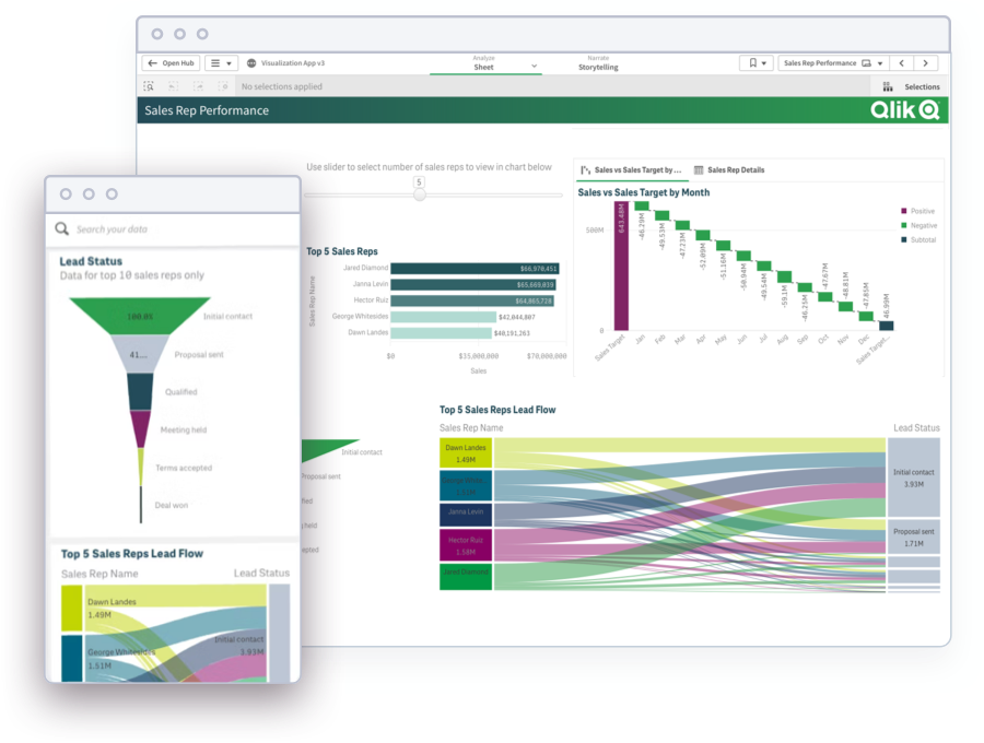
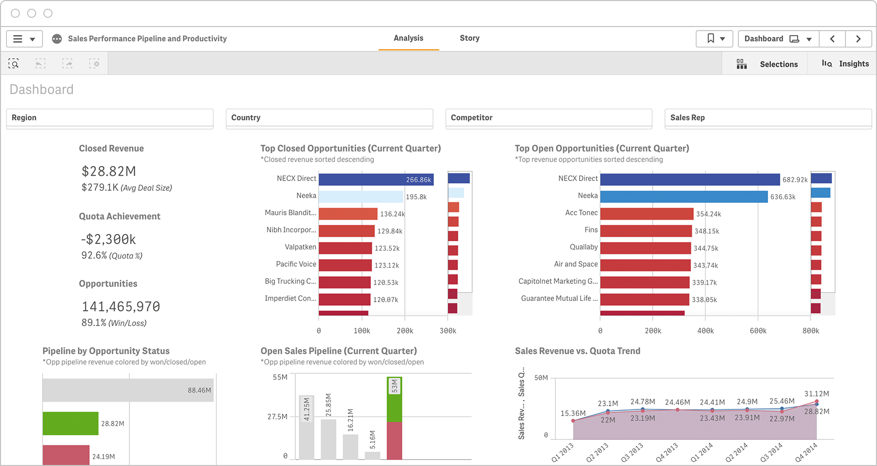
Sales
Visualize trends, track KPI performance, refine forecasting and boost revenue with effective sales reporting dashboards.
-
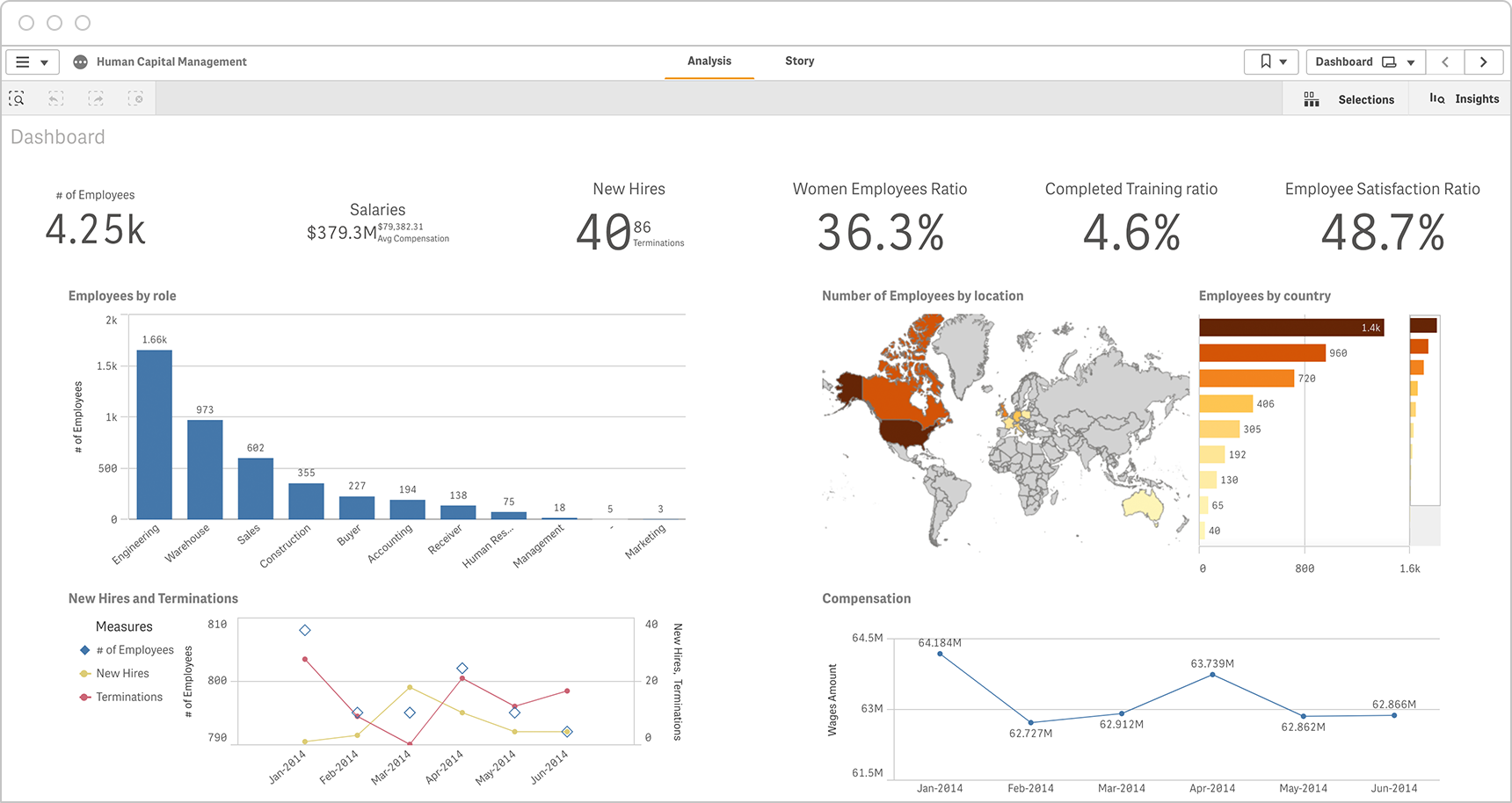
Human Resources
HR reporting dashboards can help you improve employee management by better analyzing benefits, turnover and other employee data.
Check out these additional dashboard examples:
How to Design Best-in-Class Dashboards
Download our ebook with 4 must-see dashboard examples.
Top 3 Benefits of Dashboard Reporting
- Get the most value from your data: With so much data flowing into your organization, turning it into valuable insights is a challenge. Dashboards can help you make sense of it all so you can make the decisions that move your business forward.
- Increase data literacy: Creating a data-driven culture benefits the entire organization. Dashboards make it easy for employees of all skill levels to explore trends, share insights and take action for the best business outcomes.
- Land more executive approvals: While dashboards can help you better respond to changes in your business, they can also help you get buy-in from key stakeholders by presenting key KPIs to them in a way they can understand.
How to Create Dashboard Reporting
To create your own dashboards, keep the following best practices in mind.
Take stock of your data
First, find out what types of data you can access, what you need to report on, and which decisions that data will inform.
Enable your team
Determine the highest priority goals for your team and develop dashboards that will steer them toward the best course of action.
Empower users to explore
Give users the tools to get the complete story from their data by allowing them to explore all angles of their data — not just conduct linear queries.
Keep visuals simple
If your dashboard has too many complex options, users can become confused. Aim to deliver quick insights with clean, simple views. Get inspired by the ten best modern data visualization examples.
Allow users access to the right data
Make it easier for users to target the insights they need by providing them access to only the data that’s relevant to them.
Embed reporting into everyday tools
Give users access to insights wherever they work by embedding reporting into websites, apps, portals and processes.
Analyst Perspectives
Compare the best reporting software with the latest analyst reports.
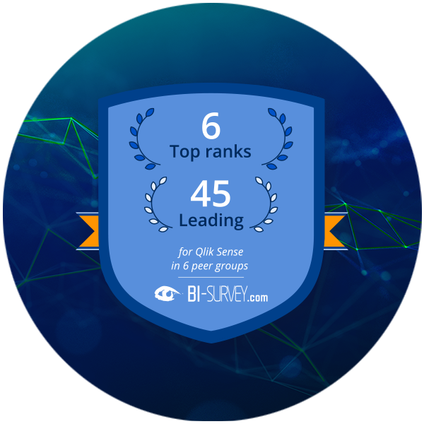
BARC: The BI & Analytics Survey 2022See how top dashboard and analytics tools stack up in the world’s largest independent survey of BI users.
-
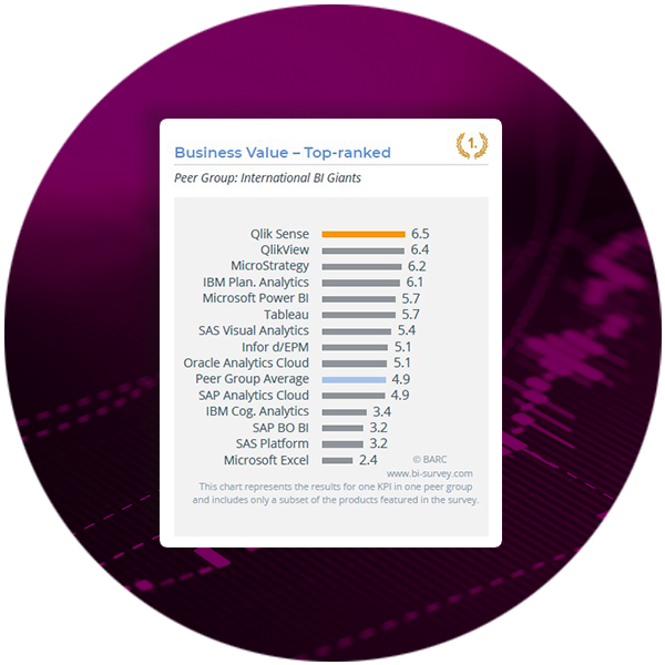 Qlik Sense earned 6 number one KPI rankings including Business Value and Analyses, and 45 leadership positions.
 -
 89% of surveyed users rated Qlik Sense Dashboard functionality as excellent or good.
Find out why Qlik has been named a Leader in the Gartner Magic Quadrant for Business Intelligence and Analytics Platforms the 12th year in a row.
Key Capabilities of Dashboard Reporting Tools
With so many dashboard reporting tools to choose from, it’s hard to know which is right for your organization. The best dashboard software and data visualization tools provide a range of essential capabilities. Following are key features for best-in-class tools.
10 features of the best dashboard reporting tools:
Want more dashboard examples?
FAQ
-
Reports provide historical insights on existing data and are usually run on a regular basis. A modern, interactive reporting dashboard lets users explore data to gain new insights into why those things happened.
-
A dashboard report helps you quickly see progress against KPIs and other metrics. This kind of reporting helps you visualize your data, as well as explore and analyze it in a variety of ways directly within the dashboard.
-
A dashboard should include the KPIs that are most important to your team. It should pull in data from a variety of systems including web analytics, CRM, sales and other applicable data. Users should be able to easily spot trends, manipulate data and communicate their data story.
-
Dashboards help you gain more value from your data, get buy-in from stakeholders and increase data literacy across the organization.
-
Dashboards should integrate data from a variety of systems, allow users to freely explore their data, provide AI-powered recommendations and allow you to embed visualizations into apps that business users access every day. You should be able to use dashboard reports without limitation on mobile and empower users with governed self-service options — all from a single interface.