Visual Analytics
What it is, why it matters, and best practices. This guide provides examples and practical advice to help you perform world-class visual analytics of your own.
What is Visual Analytics?
Visual analytics is the use of sophisticated tools and processes to analyze datasets using visual representations of the data. Visualizing the data in graphs, charts, and maps helps users identify patterns and thereby develop actionable insights. These insights help organizations make better, data-driven decisions.
Visual Analytics Benefits
Sometimes confused with data visualization, visual analytics isn’t simply a matter of representing data graphically. Modern, interactive visual analytics makes it easy to combine data from multiple sources and deeply analyze the data directly within the visualization itself. Plus, AI and machine learning algorithms can offer recommendations to help guide your exploration.
Ultimately, visual analytics helps you turn massive data sets into business insights which can have a major positive impact on your organization.
- Share findings and track progress: Interactive reports and dashboards help users track, organize and share key performance indicators across an organization.
- Make faster decisions: Users can understand data insights much more quickly by seeing and working with data sets when they are in a visual format.
- Explore data more easily: Self-service analytics tools which allow users to interact with data in a visual context allows them to discover hidden relationships and patterns in the data without relying on help from IT.
- Promote data literacy: Making data easier to work with and understand democratizes data analytics, getting more people across and organization involved.
10 Ways to Take Your Visualizations to the Next Level
Visual Analytics Examples
-
Marketing
In this example, visual analytics helps a marketer boost ROI by letting them see and understand each phase of the customer life cycle. This is made possible by connecting data from the CRM, advertising tools, and web analytics platform. -
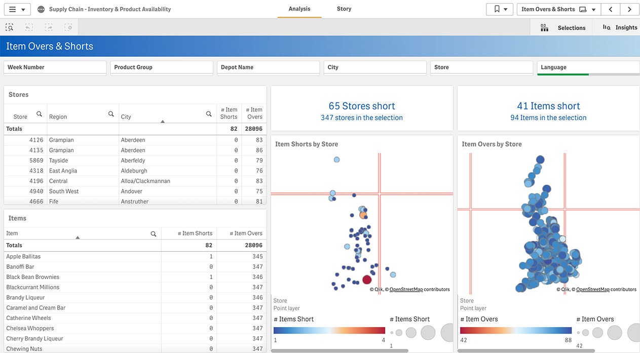
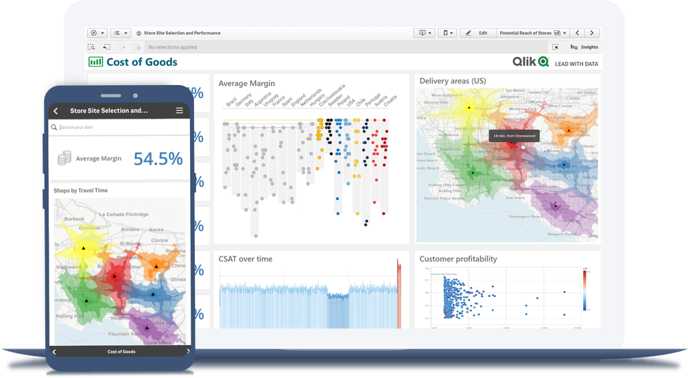
Supply Chain
Big data visual analytics can help supply chain managers immediately find connections between complex, disparate data sources by surfacing KPIs and allowing interactive exploration. -
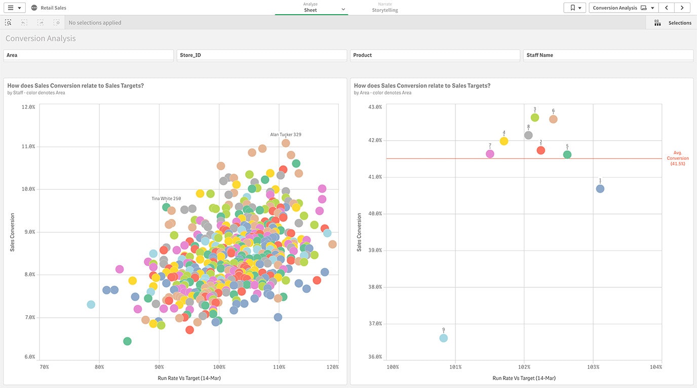
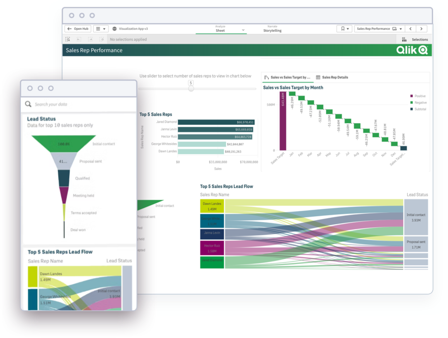
Sales
Sales managers benefit from the clean, organized presentation of sales data to increase revenue, improve forecasting, and identify key trends.
-
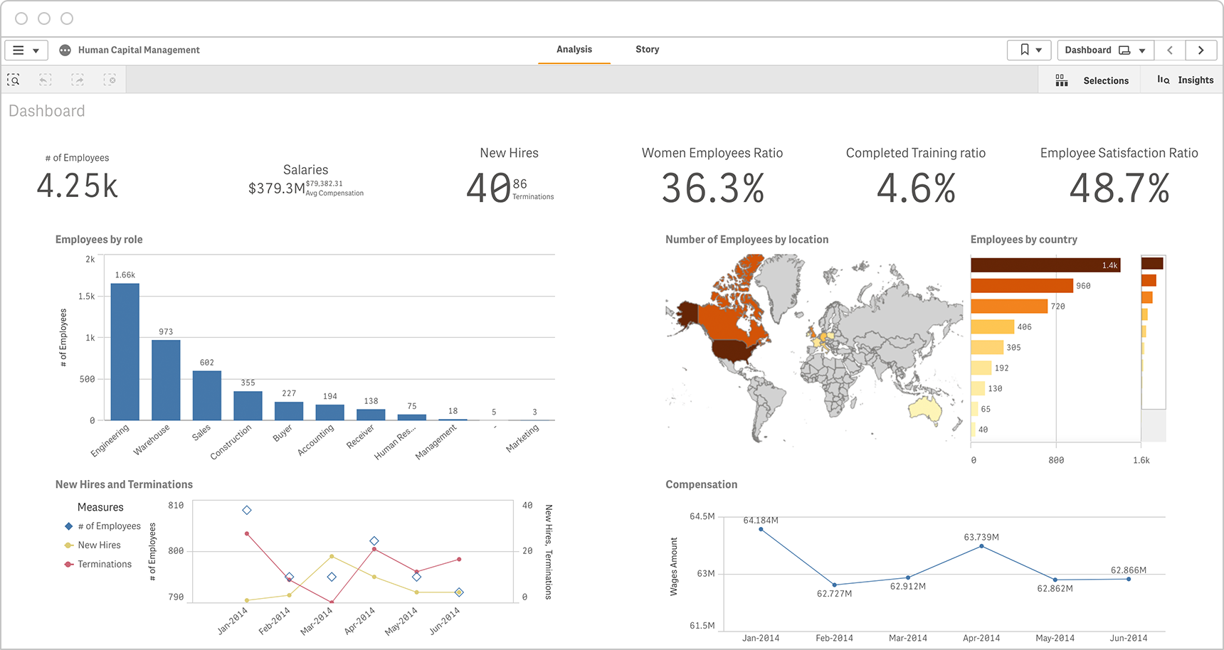
Human Resources
Visualizations can provide HR executives the ability to review and analyze KPIs in a single dashboard. This example shows data on employees by role and by location, plus key data such as gender ratio and training progress. -
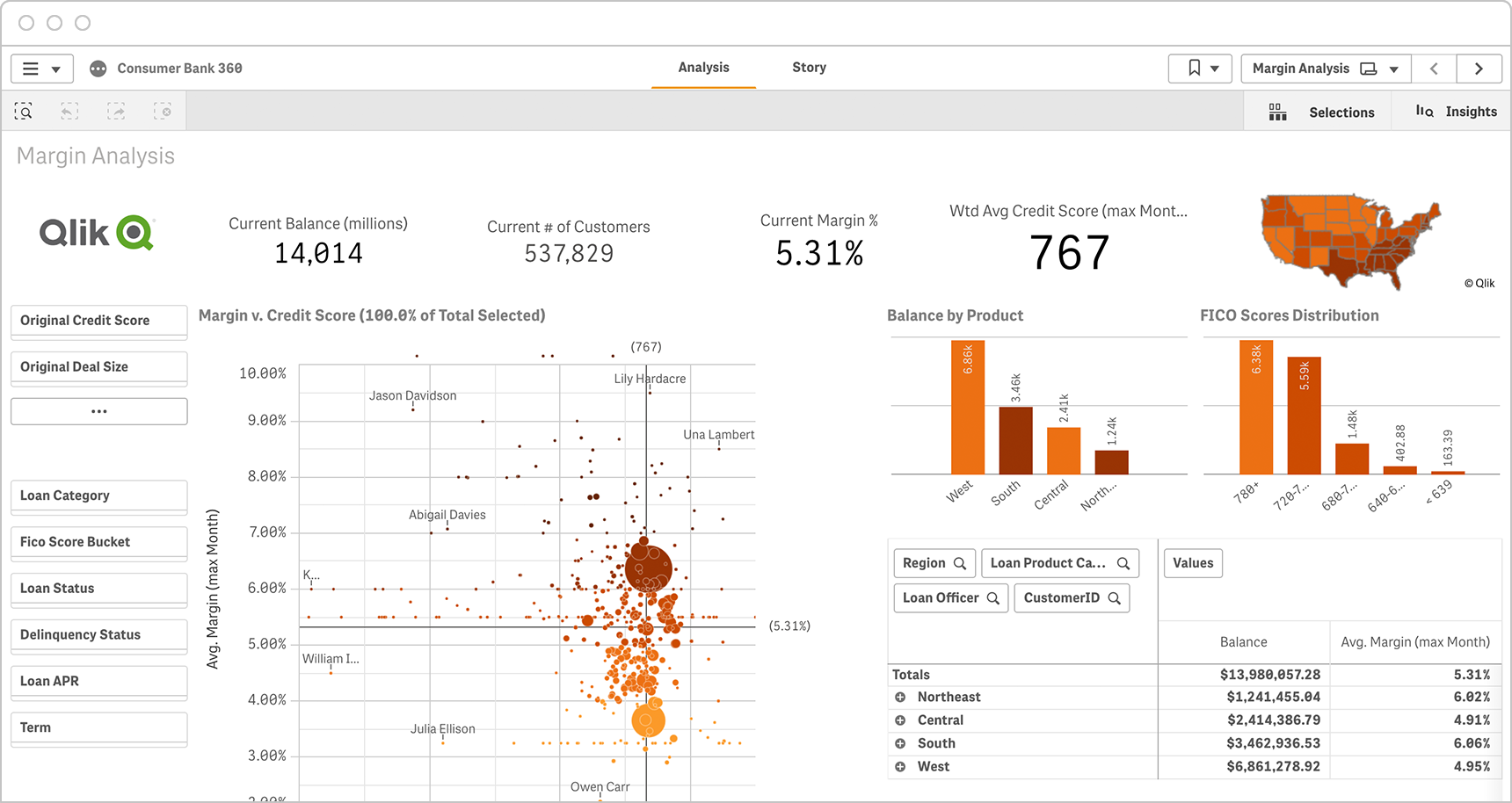
Finance
In this example, a loan manager at a consumer bank can explore how different regions, product and loan officers perform over time and drive the biggest impact on revenue and margins. -
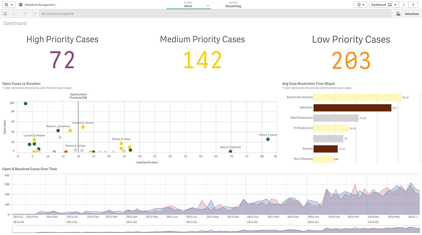
IT Visual Analytics
IT managers can leverage data analytics and visualization to better anticipate upcoming technology needs and identify underused systems and applications.
Dashboard Demo Videos
See how to explore information and quickly gain insights.
- Combine data from all your sources
- Dig into visualizations and dashboards
- Get AI-generated insights
Visual Analytics Best Practices
To help you be successful with visual analytics, we’ve compiled the following key best practices to be aware of.
Define goalsBefore you begin, be sure to define specific goals for your visual data analysis work. What specific questions are you trying to answer?
Integrate and manage the dataYour source data needs to be transformed into clean, business-ready information. You’ll need to combine and replicate data from a variety of sources and then bring it into standardized formats stored in a repository such as a data lake or data warehouse.
Simplify visualizationsChoose the right visual technique to present your story in the simplest way possible. Learn more about visualizing data.
Get InspiredSee the ten most compelling and interesting data visualization examples from recent years.
Visual Analytics Software Capabilities
Integrate and manage big data

Allow free exploration

Suggest visuals with AI

Embed everywhere
Analyst Perspectives on Visual Analytics
Compare the best analytics software with the latest analyst reports.
BARC: The BI & Analytics Survey 2022See how top dashboard and analytics tools stack up in the world’s largest independent survey of BI users.
-
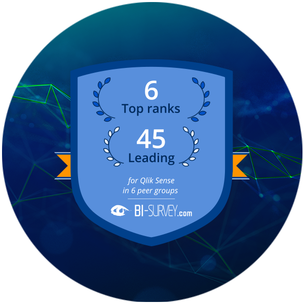
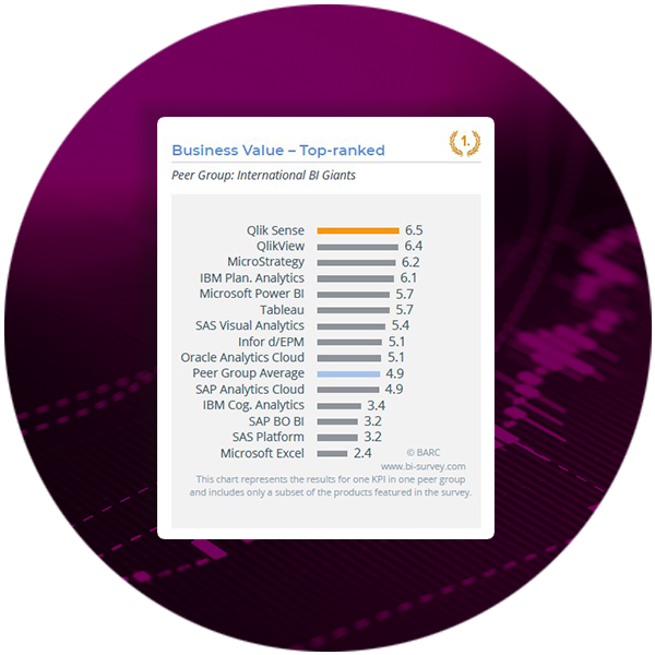 Qlik Sense earned 6 number one KPI rankings including Business Value and Analyses, and 45 leadership positions.
 -
 89% of surveyed users rated Qlik Sense Dashboard functionality as excellent or good.
Find out why Qlik has been named a Leader in the Gartner Magic Quadrant for Business Intelligence and Analytics Platforms the 12th year in a row.
Learn More About Visual Analytics


FAQs
-
The term data visualization typically refers to the graphical depiction of data, or representing data in bubble charts, heat maps, and other visuals to help people better understand the patterns, relationships, trends, and other meaningful insights in datasets. Visual analytics refers to the use of an analytics program to perform advanced analysis of complex datasets and allow users to explore and interact with dynamic visualizations.
-
Bar charts, line charts, pie charts, cartograms, donut charts, heat maps, histograms, radial maps, streamgraphs, scatter plots, timelines, treemaps, and word clouds are some of the many ways data can be presented visually.
-
It is important because it allows users without data science skills or experience to combine, manipulate, and explore large, dynamic, multi-dimensional, and multi-sourced datasets. In a world in which big data becomes the norm, visual analytics becomes an essential tool.
-
Business users can leverage visual analytics to more easily explore and understand large volumes of diverse data and gather the insights they need to solve problems, identify key opportunities, optimize performance, and inform strategic and tactical decision-making. It can also be used to create interactive dashboards and support collaboration amongst teams working with the same datasets.